
Jelte van Abbema's bacteria typefaceAnyone who has eaten alphabet soup is guilty of building their own typography. Sure, the actual pursuit of arranging types is a lot more complicated than grouping pasta on a spoon but they’re both rooted in the same principle: giving language a form.With the ability to seemingly do anything in our age of invisibility cloaks and bacterium-sized rabbits, it’s only fitting that folks are testing the limits of typeface design by manipulating DNA or getting Google Maps in on the action.To celebrate the creation of typographies that couldn’t have existed even 50 years ago (and to give you something pretty to look at on the occasion of last week's National Spelling Bee) we've compiled 26 experimental and technologically-innovative typographies. Each one represented by its own letter in the alphabet.Letter A: Bacteria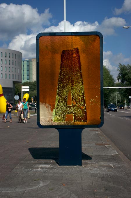 This microscopic manipulation of bacteria landed Dutch designer Jelte van Abbema $14,000 at the Dutch Design Awards. Appropriately called Symbiosis, the lettering was achieved by stamping a congregation of living bacteria with letterpress type and sustained by placing them inside a makeshift incubator.Over time, the bacteria would multiply, change color, and alter the typeface with their own mortality (as seen in the billboard version above).Letter B: Computer Code
 If Yeohyun Ahn’s alphabet looks like the frenetic stenciling of a computer on a code high, it’s because it is. Devising lean software for each font type, Ahn is able to construct each letter through a series of mathematical expressions and algorithms.Letter C: TV TypeWith a dot-matrix grid as his remote, designer Jack Archer used a custom shelving unit and 15 TVs to light the letters A through Z.Letter D: Alphabet MapsYou might be thinking: that doesn’t look like the letter “D.” Well, that’s because it isn’t. It’s actually a map of Great Britain and Ireland that shows the geographic density of placenames in the British Isles that start with the letter “D.”Using data publicly available from the NGA GEOnet Names Server, Mukund Unavane charted the geographic propensity for places in Great Britain and Ireland that start with each of the alphabet’s 26 letters and made a map for each one.Letter E: Car-DrawnTalented race pilots have been known to scorch the pavement with figure 8’s but never to aid in the creation of a new typography. Race car pilot Stef van Campenhoudt, then, might be the first of his breed, as he helped typographers Damien Aresta and Pierre Smeetsand artist Zach Lieberman design IQ Font. Check out the stunt driving in action.Letter F: White Blood Cells Neutrophil granulocytes are the most widely dispersed types of white blood cells in your bloodstream and are often the first responders when your body is subject to a bacterial infection.Their nuclei darkens as they’re overcome by disease but not usually in a way that spells out the Roman alphabet. But as Adam S. Morgan and David T. Yang documented, atypical nuclear segmentation in the body of an 80-year-old man suffering from bilateral lobar pneumonia revealed a strange phenomenon: all 26 letters had formed on the nuclei of his blood’s neutrophil as they combated different strains of disease.Letter G: Geo-Positional Running
 For those unfamiliar with Figurerunning, it’s pretty much exactly how it sounds. After discovering a familiar shape on a map--let’s say, a dinosaur--you turn on the Figurerunning app, which logs your GPS location with a colored line. As you run across the plotted path, Figurerunning treats you as the pencil to its paper and draws your journey. As pictured above, sketching out typography with your feet is highly encouraged.Letter H: Google MapsWith his hometown of Victoria, Australia as his canvas, Rhett Dashwood scoured Google Maps for instances of accidental lettering as shaped by its countryside.Letter I: Barcode
 Only 60 years old, barcode’s ubiquity has robbed it of its magical novelty as it’s become little more than a blotch on the things we buy. But buried within its systematic zebra stripes are unlimited possibilities. For example, the barcode above--though only inches in size--can project the letter “I” to a network of checkout machines as well as any information associated with it. They’re the hieroglyphics of the digital age.Letter J: Animated & Sound GeneratedMemories of grade school might remind you of the countless hours spent learning the sounds associated with letters. Playing mad scientist, Jordan Burnett has added his own version of aural associations to the Roman alphabet.As his experimental video illustrates, Burnett devised a way by which he could create character-specific sounds based solely on the shape of each letter.Letter K: Wet Ink On Wet Paper
 Rus Khasanov is something of a typographic genius as five of his creations have made this list. Micro Type, pictured above, is a typeface of microscopic reactions as wet ink is applied to the surface of wet paper. Captured using a macro lens, each letter looks like a miniature super nova contained by the skeleton of lettercasing.Letter L: Photographic Light Capture
 Chris Page corralled color-changing lights onto letter-shaped reflective stenciling to achieve the above effect. Once the patterns converge on the letter to the desired effect, Page photographs the image.Letter M: DustThis is Rus Khasanov’s second typographic project of the list. Using magnifying glasses and a swabbing system, Khasanov was able to gather dust to create a typography that looks like chandeliers made out of bubbles.Letter N: High-Speed Photography & Milk
 Sequences is a real-time art fest that takes place annually in Reykjavík, Iceland. A team headed by designer Jónas Valtýsson hinted at the festival’s real-time focus by creating a typeface made of falling streams of milk, which were captured with high-speed photography.Letter O: Three-Dimensional History
 Two very big 3-dimensional thumbs up to this idea. To commemorate the history of particular typefaces, design studio johnson banks 3D-printed letters whose forms illustrate the origin and character of each.The “O”, for example, pays homage to OCR-A font, which was developed as a multi-purpose font that could be read with ease by humans and computers alike. It’s jagged, otherworldly design is exemplified by the spiked cityscape of the printed sculpture.Letter P: Pixel DistortionThere’s no stopping Rus Khasanov. In another typography experiment, Khasanov gives the paper-smooth surfaces of computer screens a neon-encrusted bubbliness by dabbing liquids on them.Letter Q: iPod Touch Pixel Painting
 Classmates Cameron Zotter and Jinhwan Kim used an iPod Touch to project a moving image of letters from the alphabet. As each letter skirted across the screen, a long exposure photograph captured the span of the movement. The end result are letters that look as they’ve been sliced by blades of shadow.Letter R: Analog & Digital MeshIsabel Seiffert achieved the retro-future look of her typography by playing with alternating layers of analog and digital textures.Letter S: Biotypography
 Oded Ezer might be typography’s most dedicated and off-kilter personality. Apart from developing typosperma, which is a hypothetical creature that is half-human sperm, half-letter (as seen above), Ezer has looked into a world where typoplastic surgeries, leech letters, and animals in the shape of letters or words might be commonplace.Letter T: Repurposed Dismantled SignsRather than see old fascia signs end up in the dump, Finland-based Character use the most striking letters as repurposed home accessories. They replace the neon tubing with LEDs, give it a power source and chord, and ship it wherever your typographic-loving heart desires.Letter U: MultisensoryEducation needs a redesign. Despite the common knowledge that not all children learn in the same manner, most schools follow phonemic or strictly visual teaching practices. In an effort to curb the age-old ineffectiveness of education’s shortcomings, designer Alan Murphy has come up with a multisensory typography. Made out of plasticine, children and teachers would use Murphy’s multisensory kit to learn about the alphabet through touch, sight, and sound as they mold their own letters.Letter V: DNA
 Most of us used building blocks as kids to form shapes or even letters. Working off a similar construct, scientists figured out a way to use DNA strands in the form of rectangular tiles to plot out the Roman alphabet. Beyond being infinitely cool, the technique might allow us to one day store countless bits of data inside DNA capsules.Letter W: Cat GeneratorAs the unofficial mascot of the Internet, it’s fitting that Mondo Raizo would create a cat font generator for our amusement. Known as NekoFont, kitty enthusiasts are able to tap its feline wonders on its website.Letter X: Motion GraphicsA poetic blend of digital photography, motion graphics, and perhaps some mysterious liquid allowed Rus Khasanov to create enchanting X’s that look like portals into another dimension.Letter Y: GIF & Handpainted Handpainted art forms have been around for thousands of years, but it’s Tien-Min Lao’s haunted GIF representations of her typographic experiment that give her project a modern zeal.As the GIFs make clearly evident, Tien-Min transformed the handpainted upper-case letters on her hands into their lower-case versions without modifying the shapes through external means.Letter Z: SunbeamThe typographic wiz is at it again. This time, Rus Khasanov uses the sun to create lettering by way of light dispersion. Much like rainbows create a spatial separation of white light into an intricate band of multiple colors, Khasanov uses magnifying glasses and other tools to create each light mosaic featured in his Sunbeam typeface.
Advertisement
Advertisement
Advertisement
Advertisement
Advertisement
Advertisement