
From Dean Fleischer-Camp's TOPPosters.us. Images used with permission from the artist
Dean Fleischer-Camp is an American filmmaker who understands the potency of the non sequitur and knows how and when to use it. Best known for co-creating viral gastropod Marcel the Shell with wife, Jenny Slate, Fleischer-Camp's projects toe the line between internet-aware WTF I don't even? sensibilities and biting-your-tongue-inside-your-cheek-until-it-draws-blood understatedness. His latest effort, TOP Posters, is a line of super-straightforward wall posters that pair excessively ordinary statements like "Food: Yes!" "Water is cool!" and "Money: It Can Be Yours," with stock photos worthy of the DISImages library. They're collectors' items that would fit as well as overt background jokes in Rhys Darby's pre-normcore office in Flight of the Conchords as they would unironically adorning the walls of David Lynch's cubicle, or earning at least $3 on post-internet art trawler, The Jogging.The Creators Project wanted to know more about how and why the filmmaker was trying his hand at extravagantly obvious graphics, so we talked to Dean Fleischer-Camp via email: What made you want to make TOP Posters? I was directing a TV pilot and one of the prop rental houses we were working with had a "wall art" section with all of these very generic bedroom posters. Set decorations are mostly designed to be unremarkable, to kind of recede into the periphery, but posters are essentially advertisements, the total opposite. They're meant to be loud and draw your attention, usually to a specific brand name, which movies also cannot show. So the idea of designing a "background" poster, an advertisement for nothing, is such an absurd and funny contradiction. It really appealed to me.After I had finished a few of them, I started to notice this interesting tendency they have to lay bare the really short list of human insecurities that advertisers exploit: Fear, inadequacy, boredom. Obviously everybody already knows that, but to me it feels fresh and healthy to look those things in their dumb faces.
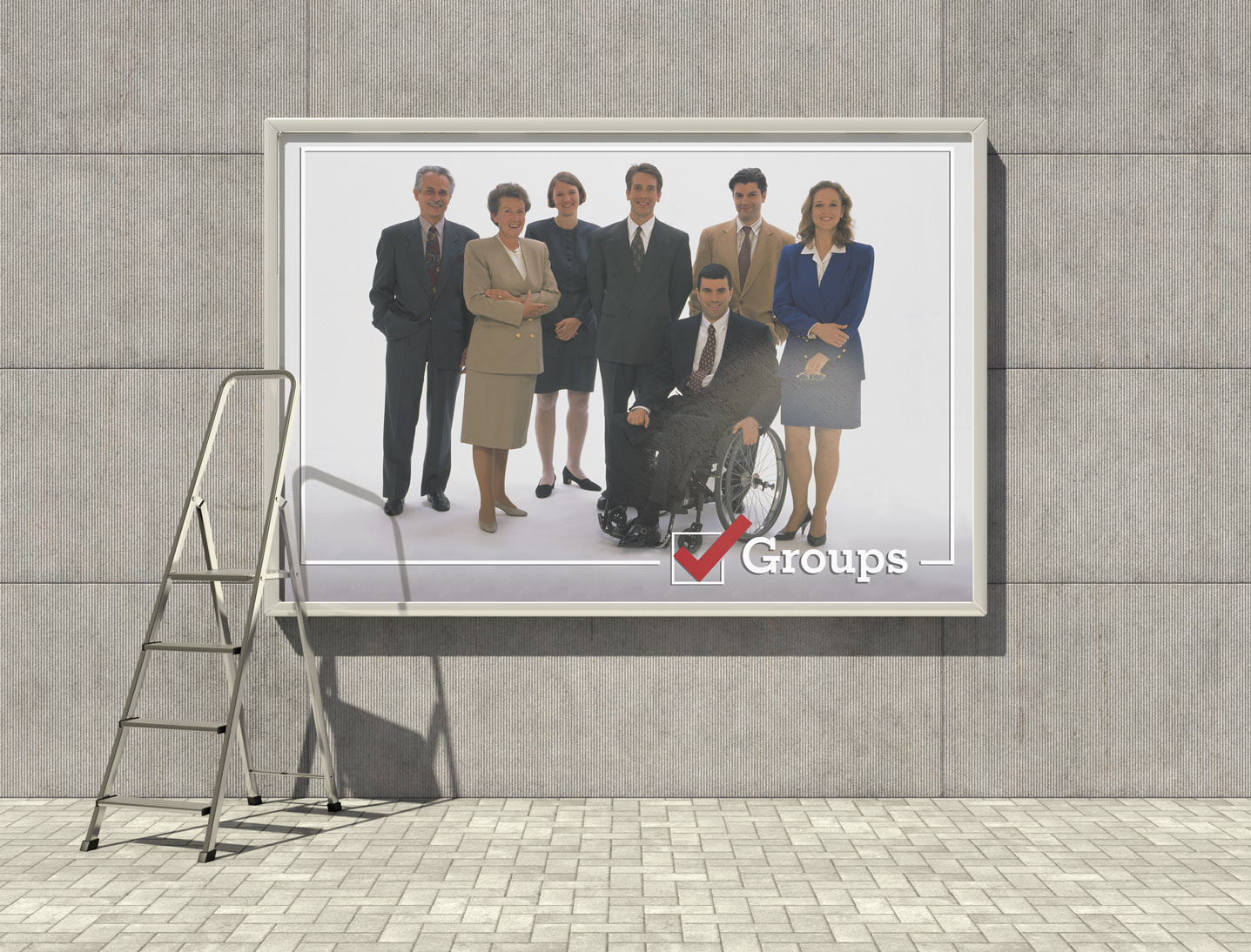 You're best-known as a filmmaker, but do you have previous and/or notable graphic design experience?Not really. I was a design major for a year in college but I ditched it to pursue film. I have a big hand in designing and illustrating our Marcel the Shell books, though I also have really talented collaborators I depend on.
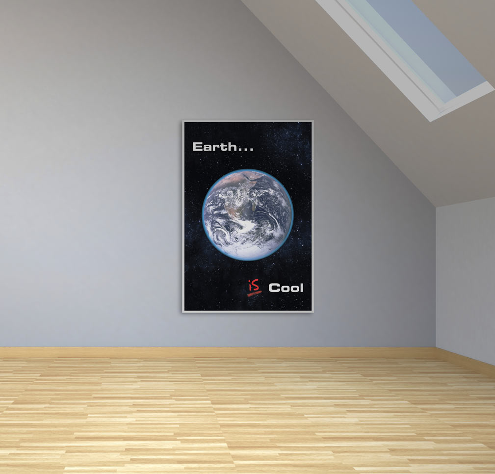 Were there specific posters you modeled them off of?Not on purpose, but influence is inescapable sometimes. A friend pointed out how much the Lightning Bolt poster looks like this one from The Truman Show. Kind of a bummer but who cares, that movie rules.Have you had any past experiences with posters you'd like to tell us about?I once found a great series of posters buried in my mother's office. She's a social worker and I think these were used as a teaching aid to help autistic children recognize facial expressions? They're just these big blown-up photographs of people's faces caught in expressive moments. There are no words. They're perfect.
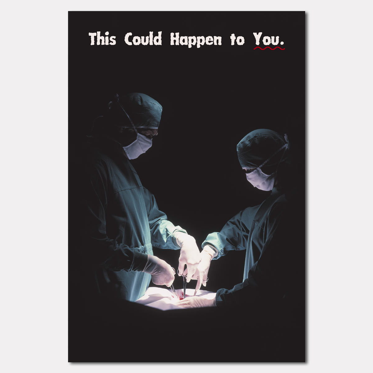 IS IT ANTI-COMEDY? (that one's a joke don't answer it)lol no it's normcore jk
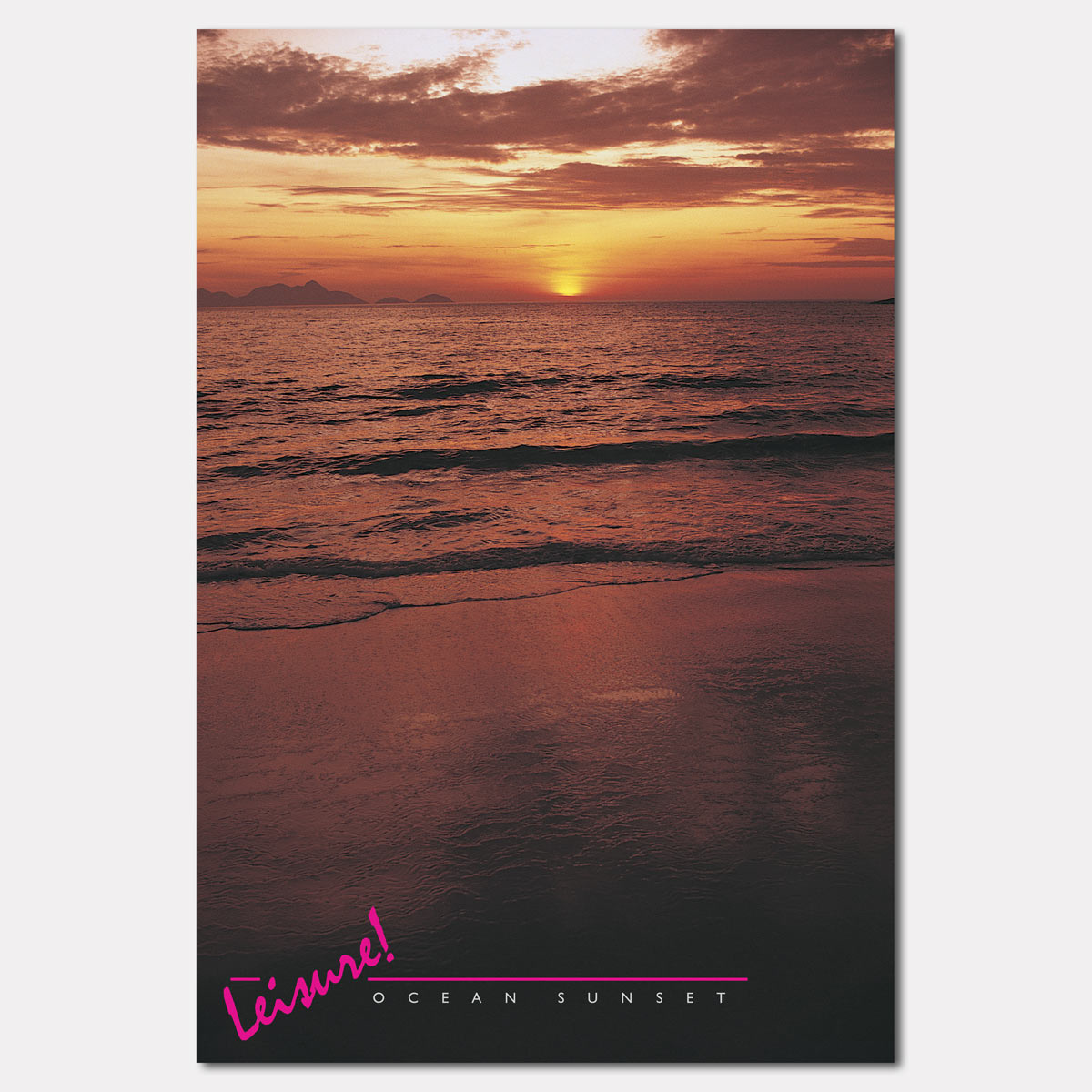 Tell me about choosing the fonts (do answer this)I tried to stick with fonts that were classic and neutral. Or ones that were so clichéd that they carry almost no meaning anymore. The fun I think is in trying to add design elements without actually adding information. I also had help from Teddy Blanks at CHIPS, who consulted. He's incredibly talented but also really short, probably 4'10" I would say?
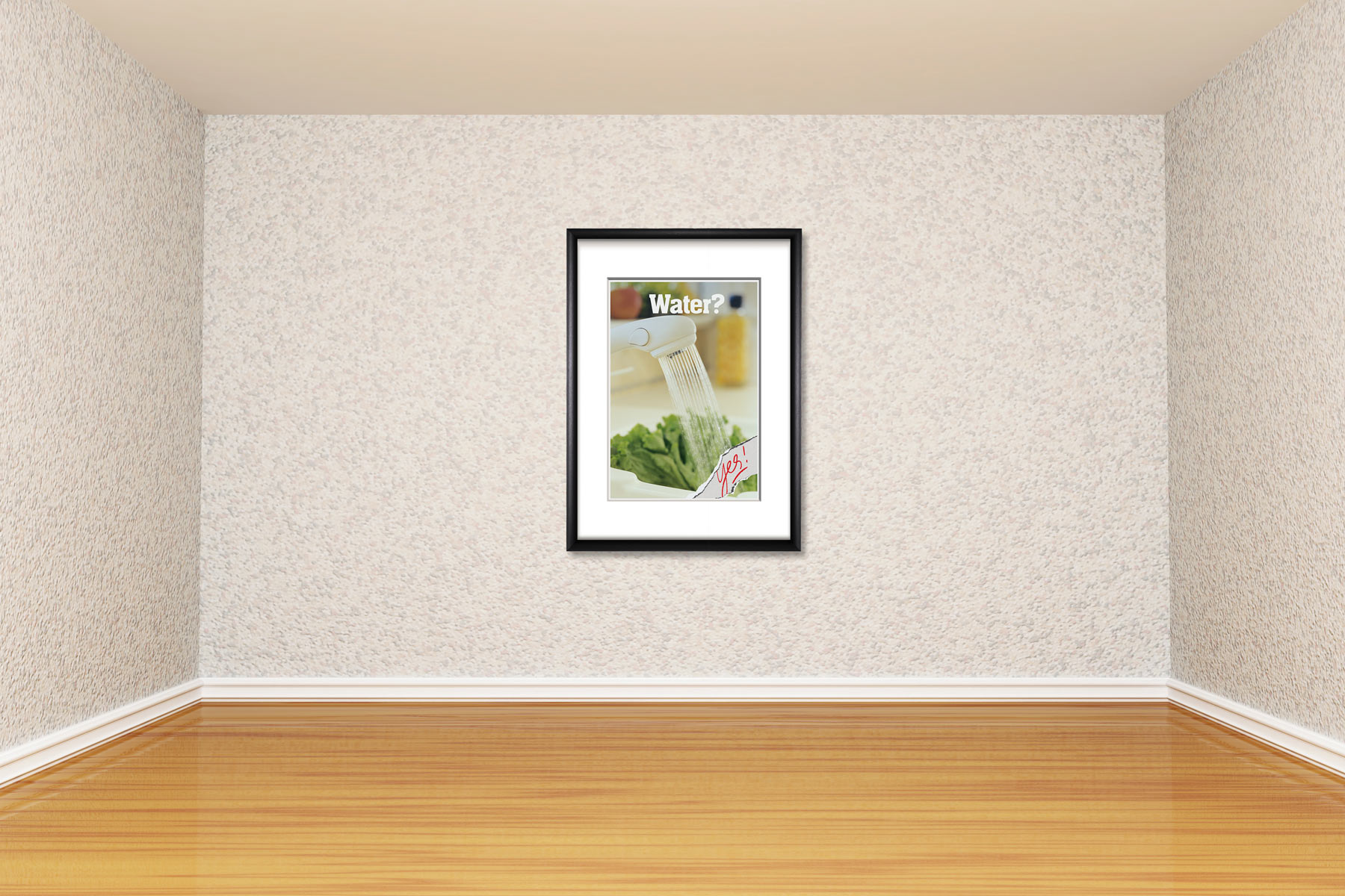 Who's your ideal buyer? Honestly I wanted to place these on billboards around Los Angeles, but it was way too expensive. My ideal buyer is someone with a substantial inheritance who wants to blow it all on short-lived notoriety? Either that or an elementary school teacher. I would love to get some of these up in classrooms.
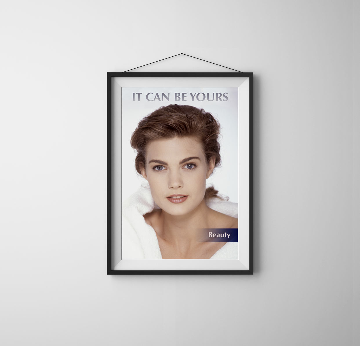 Where's this project going & will you be making more? I'm working on new ones already. I started working on these when I was between projects, partly as a way to continue exploring a style and tone that I've been developing in some of my other short film work, like this one, called Catherine. It's putting the horse before the cart, but I'm looking forward to using these posters in the backgrounds of my own films.
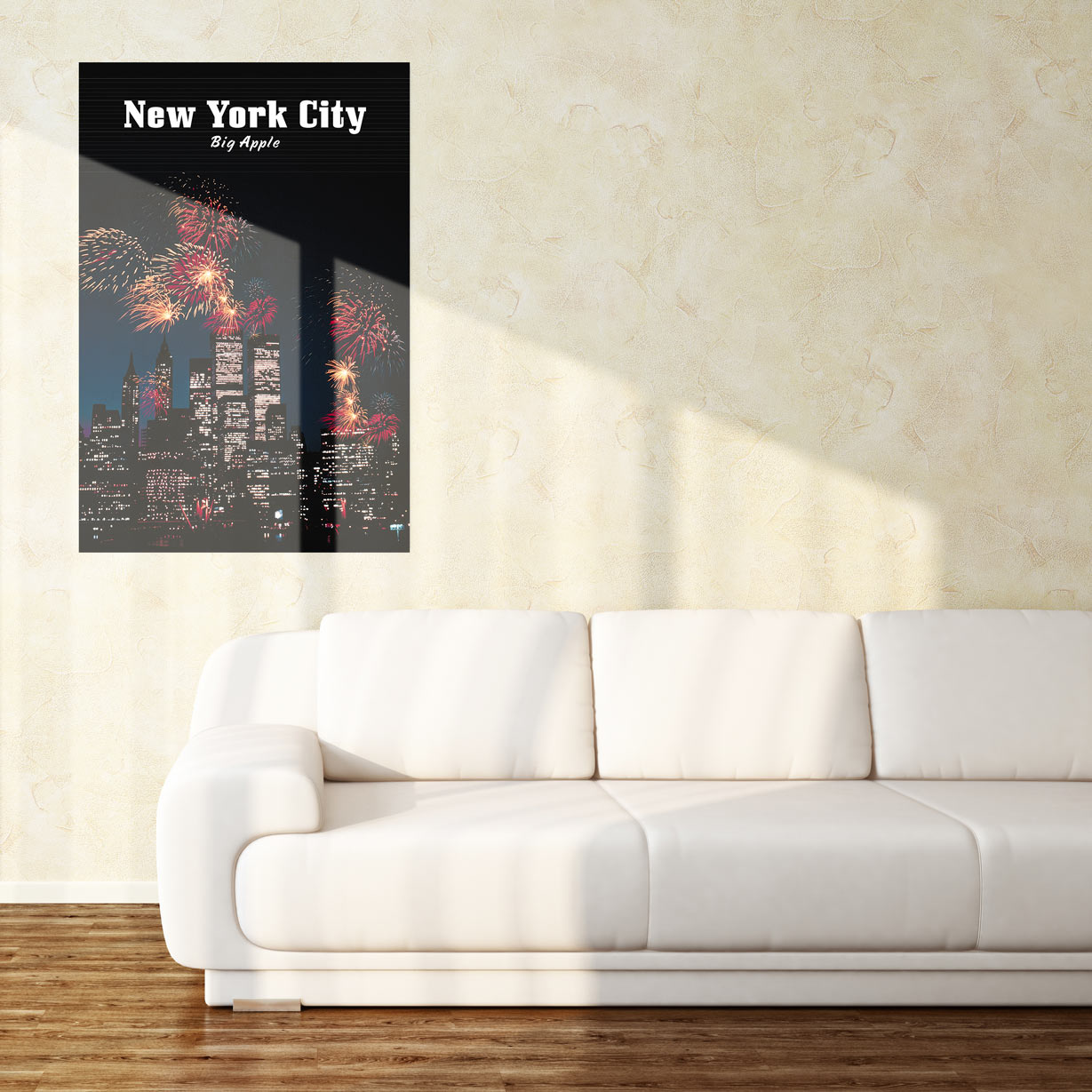 Overintellectualizing exclamations like "Beauty: It Can Be Yours" poses a threat to consumers and critics alike; stare too long and you look stupid, ignore it and you're missing the point. Like smart things you say when no one's listening and, often, the best dad jokes, the appreciation begins and ends on the surface. Sure, they're facades, but they're important: without them, walls would be boring.Visit TOPPosters.us to order your own.Related:We Talked to the Co-Creator of Marcel the Shell, the Internet's Favorite MolluskFirst-Time Filmmakers: "Obvious Child" Writer/Director Gillian Robespierre'Too Many Cooks' Creator Casper Kelly About Surrealist Anti-ComedyIt's Art: Resuscitated CPR Dolls & Dante's Divine Comedy
Advertisement
Advertisement
Advertisement