

Image via Nicolas BelmonteKara Woo and Erika Mudrak find beauty in mistakes and curate mathematical mess-ups. The two, a data manager and statistical consultant, respectively, realized their interest in errors after Woo tried to visualize some data for a research project she was working on and repeatedly failed. After Woo posted some of these failed attempts on Twitter, Mudrak replied with some of her own, saying she'd been thinking of working them into a blog.The two then joined forces to create Accidental aRt, a Tumblr highlighting wondrous and beautiful failed data visualizations from around the world. In one of Woo's original failed data visualizations, which eventually showed up on Accidental aRt, the site's visitors can see how her attempt to make a bathymetric map of Lake Baikal look “a little fancier” instead resulted in dynamic artistic mutation. By Ryan Terrill“We both have backgrounds in scientific research,” said Woo. “So we're both pretty familiar with some of the challenges that come with analyzing and visualizing data.”While familiarity with data and science might be a given for the pair, how have they taken to their new roles as art curators of sorts? The duo are open to most submissions, provided there is no image manipulation or erotic elements.“The only real criterion is that the image be some sort of data visualization, though it's possible we've even bent that rule,” Woo said. “We sometimes get submissions that were image manipulations or other non-data things, and we usually don't post those. Other than that there aren't any specific criteria.”
 By Jacob Stoklusa“If it's something we think looks cool, one or the other of us will post it,” she added. “If we're unsure, we consult each other. Once we got a submission that looked rather suggestive and we opted not to post it because this is a family-friendly blog.”In one of Woo's favorites, a contributor by the name of Ryan Terrill submitted a visualization in which he tried to “map two raster layers [pixel-based graphics] on top of each other” but accidentally plotted the values against each other. The result is like pixilated tendrils spiraling together into a digital organism. In another glitchy data viz, Jakub Stoklosa, a lecturer at University of New South Wales, attempted to create contour plots from trait and environmental variables. Instead, he got a shimmering yellow and red psychedelic pattern.
 “I like ones that could fool me in a modern art museum, have interesting 'texture,' or that look like something else entirely,” added Mudrak.One of Mudrak's favorites was created by a user who made a number of “recursive calls to polygon to generate pseudo-gouraud shaded triangles.” Gouraud shading is used in computer graphics to shade surfaces with polygon meshes. In this particular data visualization, it didn't work out so well, though the failure wouldn't be out of place in a new media art show.
 By Andrew BarrMudrak also highlighted a piece with rich texture created by line graphs that shows a simulation in thousands of model runs. In another, someone created a data visualization that features a vast network of colored interlocking shapes that evokes, as Mudrak suggested, the sensation of looking up from the bottom of a skyscraper.Yet another contributor created what looks like a [microscope slide](http://accidental-art.tumblr.com/post/87908328674/messed-up-optimization-procedure-of-a by) messing up an “optimization procedure of a dimensionality reduction technique” (whatever that means).
 Woo also mentioned that many people call their attention to cool plots on Twitter. She was particularly impressed with one created when data visualizer Nicolas Belmonte tried to render the city of Buenos Aires but got the z-axis wrong in the process. The result is an intensely beautiful liquid-like explosion of digital information.Another failed data viz created by Alex Parker resulted in a psychedelic black and white graphic from what Parker said is the “radial and vertical velocity vector field of a sample of objects in a synthetic Kuiper Belt.” (The Kuiper Belt is the region of the solar system beyond the planet Neptune.)
 (credit: Alex Parker)“There are an infinite number of ways these accidents can happen, because there are an infinite number of mistakes one can make when trying to visualize data,” said Woo. “Some of our submissions have been the result of plotting lines connecting points where they shouldn't have, or trying to make pie charts with negative values, or accidentally using the wrong data altogether.”Woo added that many submissions come from R, a piece of software often used in data analysis and visualization; hence the name “Accidental aRt.” They've also taken submissions created in programs like the free, open-source desktop geographic information systems QGIS; data visualization software Tableau; and D3, a javascript library that allows users to manipulate documents based on data.
 (credit: Bob Rudis and Jay Jacobs)“I think it's particularly easy to for data visualization to go wrong when you're using a scripting language to create it,” Mudrak noted. “You compose the code, press run, and see what happens, but if you try to specify too many things at once, or plot the wrong things, you don't know you made a mistake until it's plotted, so it allows for some pretty interesting mistakes.”“I think the idea resonates with people because submissions are usually created during what could be a time of great frustration, trying to make the computer do what you intend,” Mudrak added. “It reminds people to step back, take a breath, and look at things from a different angle.”In the future, Mudrak and Woo would like to bring Accidental aRt off the web and into a “real life” art exhibit. For now, check out the Tumblr blog and Accidental aRt's Twitter feed, where Mudrak and Woo retweet the most recent failed data visualizations they've come across.
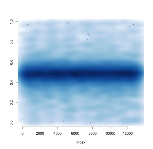 By Tanja Slotte
 By @BennoSimmons
 By @BennoSimmons
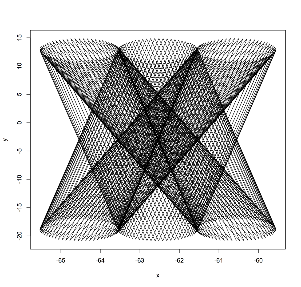 By Paul MetznerRelated:Ok, Now We Really Know Who Has The Largest Vocabulary In Hip-HopThese iOS Map Glitches Show The Warped Beauty Of Machine ErrorArtist Margo Wolowiec Turns Digital Errors Into Colorful Textiles
Advertisement
Advertisement
Advertisement
Advertisement